
Stop assuming you need an expensive addition. Transform your South Sound home by fixing the flow, not the footprint.
You Don't Need More Space.
You Need Better Design.
Most homeowners think they need 500 more square feet to solve their problems.
Usually, they don't.
I bring NYC Spatial Rigor to the PNW to unlock the 'dead space' already hiding inside your walls.
“Being our first project, Andrew was our guide through this incredible complex and bureaucratic endeavor! We are really pleased and thankful with his services and highly recommend him to anyone!”
The “more Space” Trap.
When a house feels cramped or disjointed, the default reaction is: 'We need an addition.' Contractors love additions. They sell concrete, roofing, and framing.
But here is the expensive reality of the 'Old Way':
You Pay for Shell, Not Experience: A standard 500 sq. ft. addition starts at $200,000 just for the shell. My 'Zero-Waste' reallocation strategy typically costs $0 in new square footage.
I charge for the design so you don't pay for the concrete.
The Phasing Myth: You think you can do it in stages to save money. You can’t. As noted in my renovation guide, trades like plumbers need to work comprehensively. Doing it piecemeal triples your mobilization costs.
The Result: You get a bigger house, but you still have the same bad flow—just with an extra room tacked on the back.
Before - This was the “master bathroom”, cluttered and cramped even for one person.

After - With vision, creative problem solving, and technical know-how, we transformed it into a spacious spa room.
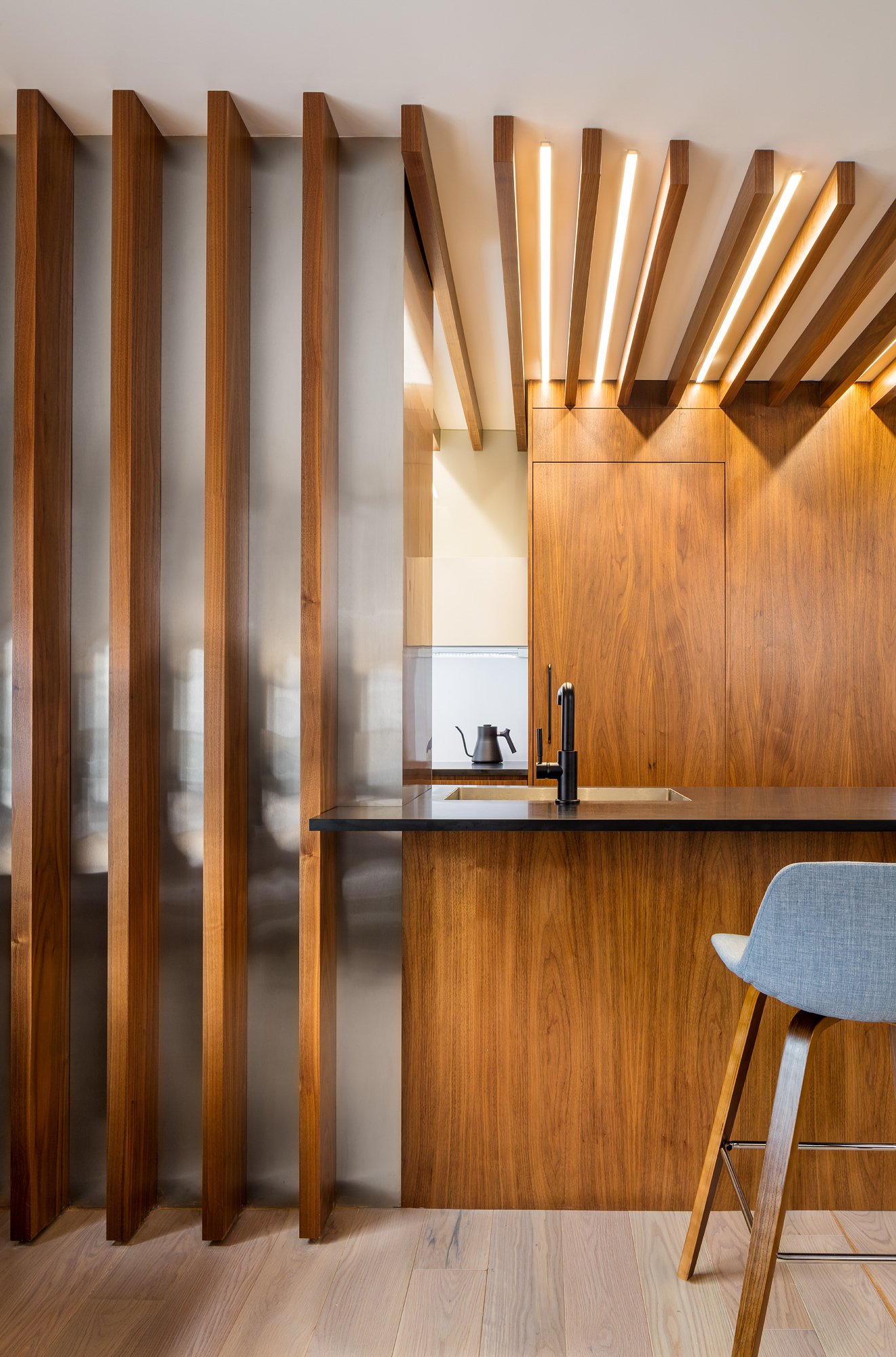
The Mechanism: "The Zero-Waste Layout"
I spent my career in New York City, where adding square footage wasn't an option. We couldn't build out; we had to build smart.
I bring that Spatial Rigor to Gig Harbor and Tacoma. I look at your home like a puzzle. I find the space wasted in hallways, oversized entries, and awkward corners, and I trade it for the Kitchen or Primary Suite you actually want."
The Difference:
The Addition: 2,500 sq. ft. of disjointed space.
The Mikhael Transformation: 2,000 sq. ft. of perfectly optimized flow.
Before - Slapped together rooms left clients feeling disjointed.

After - Without adding an inch, the home flows generously, without sacrificing privacy.
Case Study:
The University Place Transformation
I always tell clients: "You can't hide your values. They are built into your floor plan."
I recently worked with a client in University Place who lived in a beautiful 1950s architect-designed home. But the kitchen was a problem. In the 1950s, the cultural value was that cooking was a utilitarian act, meant to be hidden away in a small room.
The Pain Point: The Anxiety of Isolation
The client told me she felt "cut off" from family life. Worse, because the kitchen was tucked away, she was constantly jumpy—if someone walked in behind her, it startled her. The architecture was actually causing her low-level anxiety.
The NYC Solution: Urban Efficiency
She assumed she needed a massive addition to fix it. Instead, during our Needs Analysis, I applied an urban mindset: finding the solution inside the existing envelope. We dissolved the walls that separated "utility" from "living."
The Result: Abundance without Expansion We unlocked a wealth of new programming:
A more intimate dining area
Casual seating around the kitchen
A dedicated desk for home management (and YouTube recipe searches)
A custom bar with a wine fridge and humidor
MORE living space with 0 Sq. Ft. Added.
The Shift: The "Conductor" of the House The change was immediate. She went from being "tucked away" to being the conductor of the house.
360-Degree Visibility: She now stands at the range and commands the room:
Front: Views of the water.
Side: Connection to the dining area.
Rear: Sightlines to the backyard and bar.
See the “Conductor” concept in action. (Note: This is the design visualization used to show the client the new flow of space)
We build your home in 3D before we build it in real life—saving you from expensive 'change orders' later.


Andrew’s designs are published worldwide


Do you have any of these 5 symptoms of a bad floor plan?
If you answer 'Yes' to even one of these, you are wasting square footage
The "Dead-End" Kitchen: Is your kitchen a cul-de-sac where you feel trapped or startled if someone walks in behind you? (This causes the "anxiety of isolation").
The Hallway Tax: Are you paying property tax on long corridors that serve no purpose other than travel?
The "Formal" Ghost Town: Do you have a formal dining or living room that is used less than 3 times a year? (That’s a value from 1950, not 2025).
The View Blockers: Do you have walls separating your "utility" zones from your best views (water, garden, backyard)?
The Traffic Jam: Do guests have to walk through your work zone (the stove/sink triangle) to get a drink or go outside?
Is Your Dream Home Hiding Inside Your Current Walls?
Before you call a contractor for an expensive addition, book a Renovation Audit Call. Stop guessing. In this 30-minute strategy session, I will apply my "Space Killer Checklist" to your specific situation to see if we can solve your problems by renovating IN, not OUT.
“We had less than 4% construction overages over the course of the project.”